Redesigning our outdated Header & Navigation helped users explore products more easily and created a smoother browsing experience. This resulted in a +32% uplift in category-to-order conversion and new revenue from brand advertising placements. Users were happier, and our business saw measurable gains. We didn’t just improve the user experience—we completely rebuilt the tech stack and event tracking system to make future changes easier and to gain full transparency on user interactions. These changes also boosted performance and reduced loading times significantly.
Situation
When half your users can’t find what they’re looking for, it’s time to act.
At Grover, most users arrive with a clear goal: they already know which products they want. But how they get there is split almost evenly: some use the search bar, others rely on browsing. That makes our header and navigation mission-critical. It’s the gateway to product discovery, decision-making, and conversion.
And yet, for years, we left it untouched.
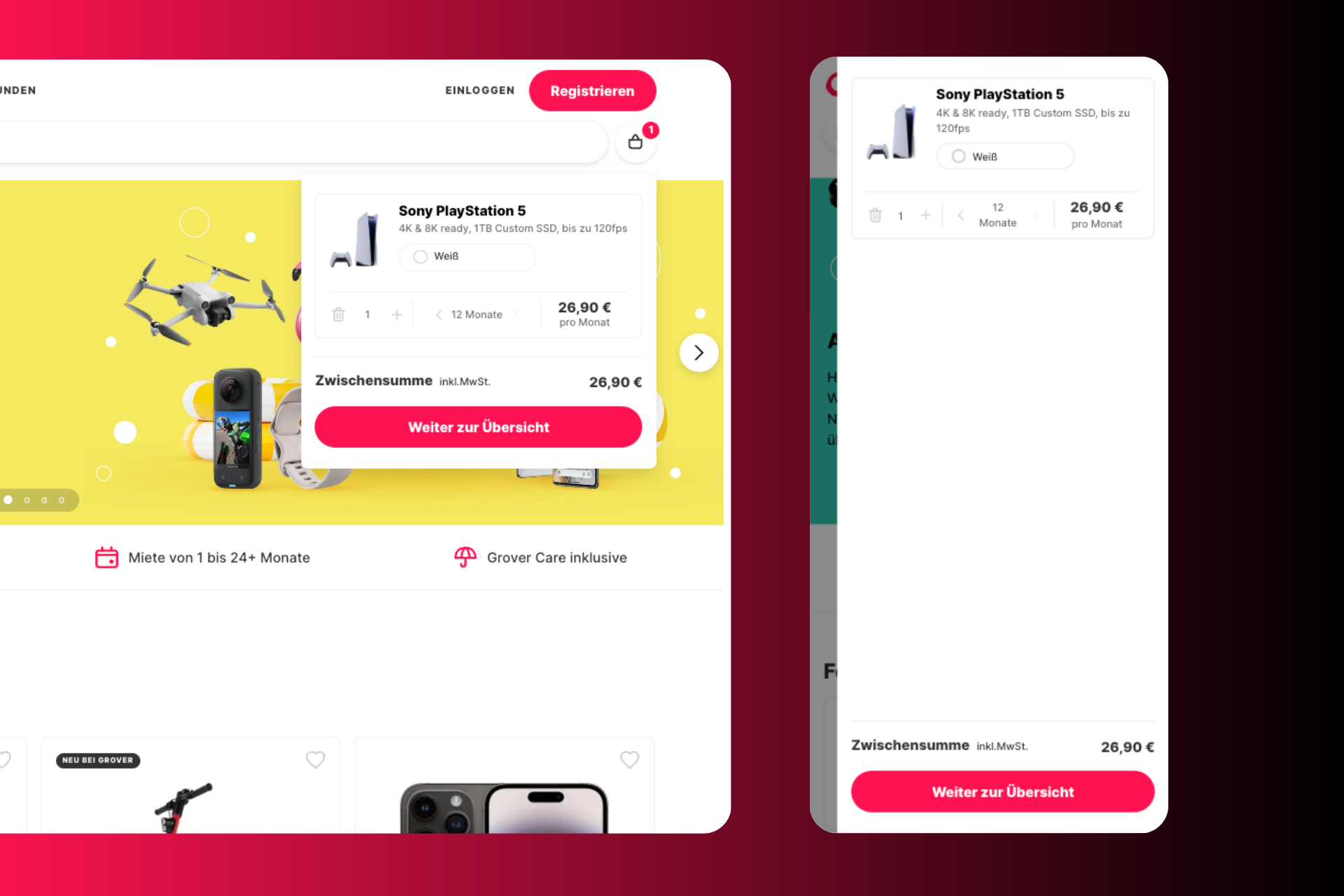
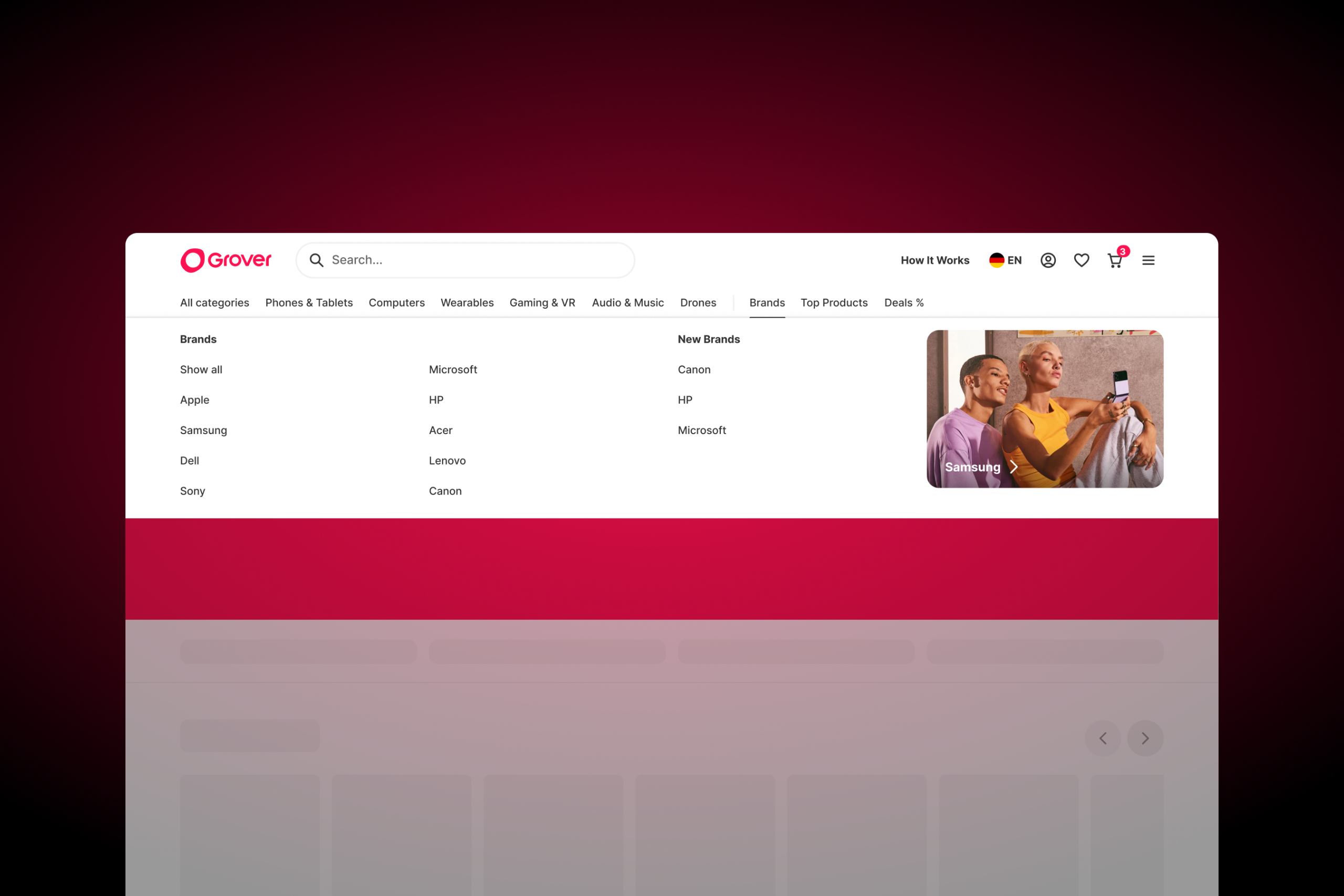
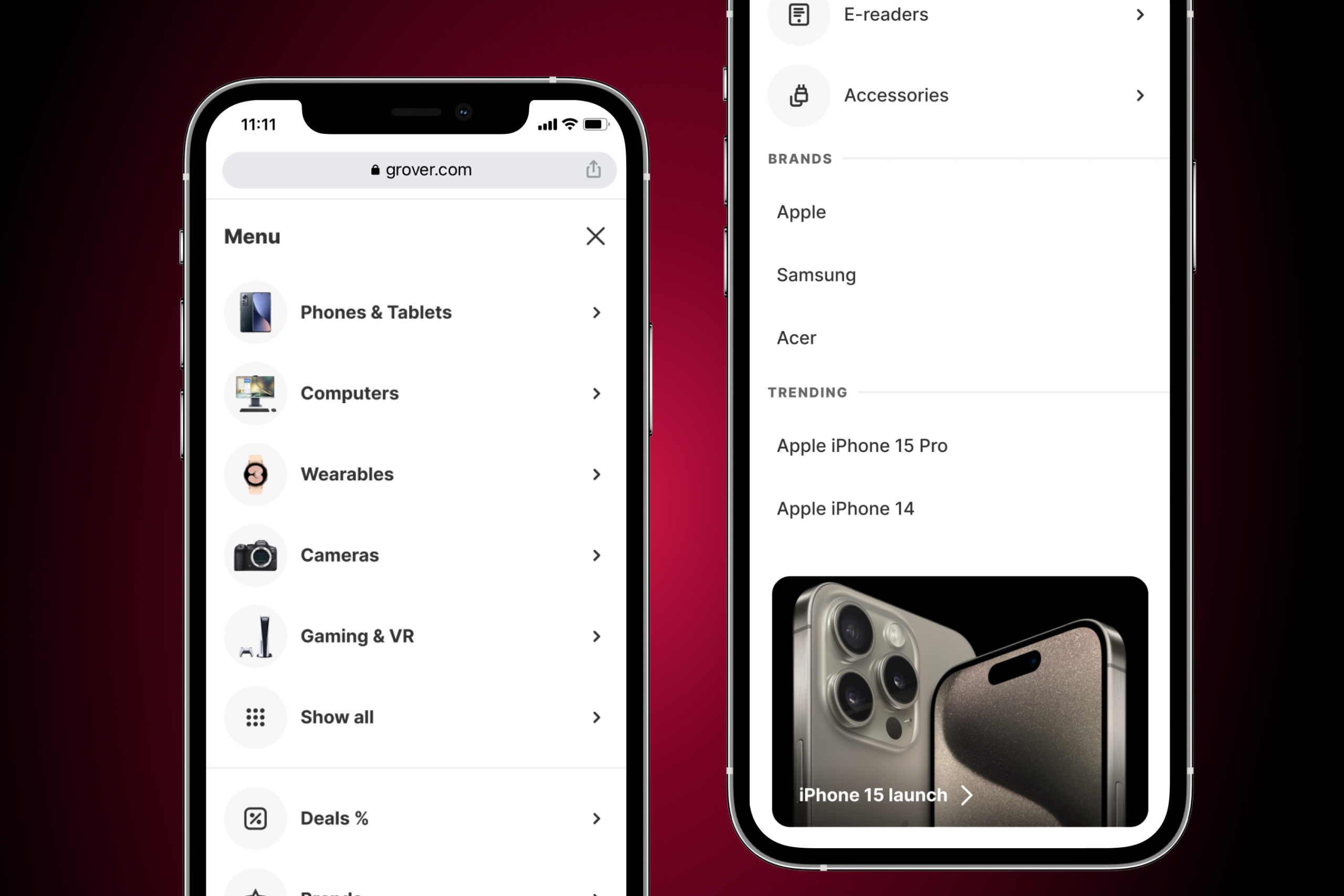
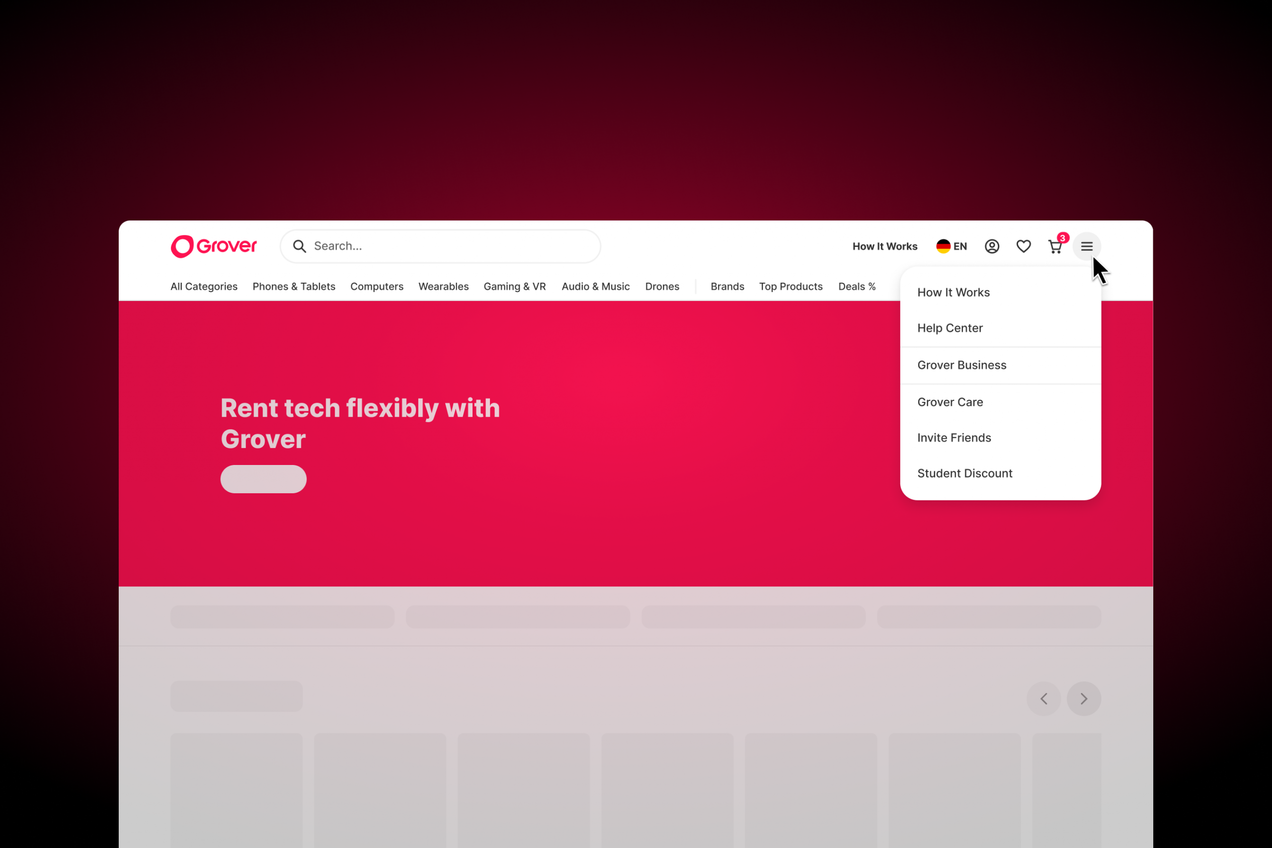
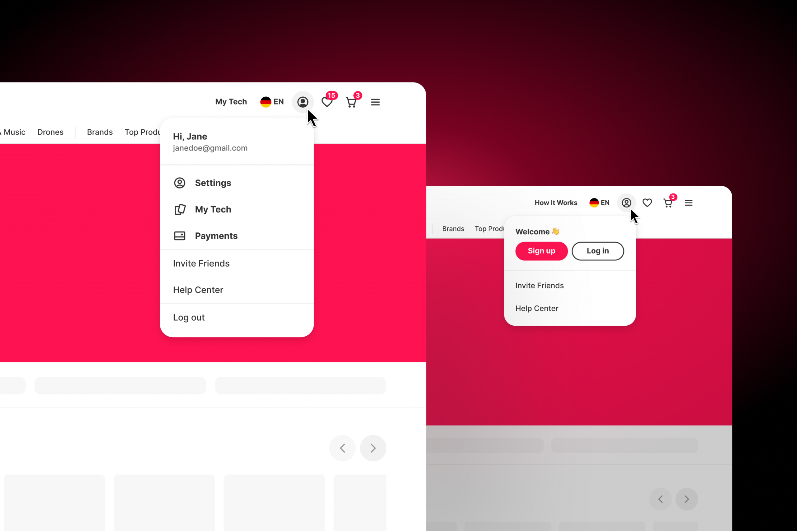
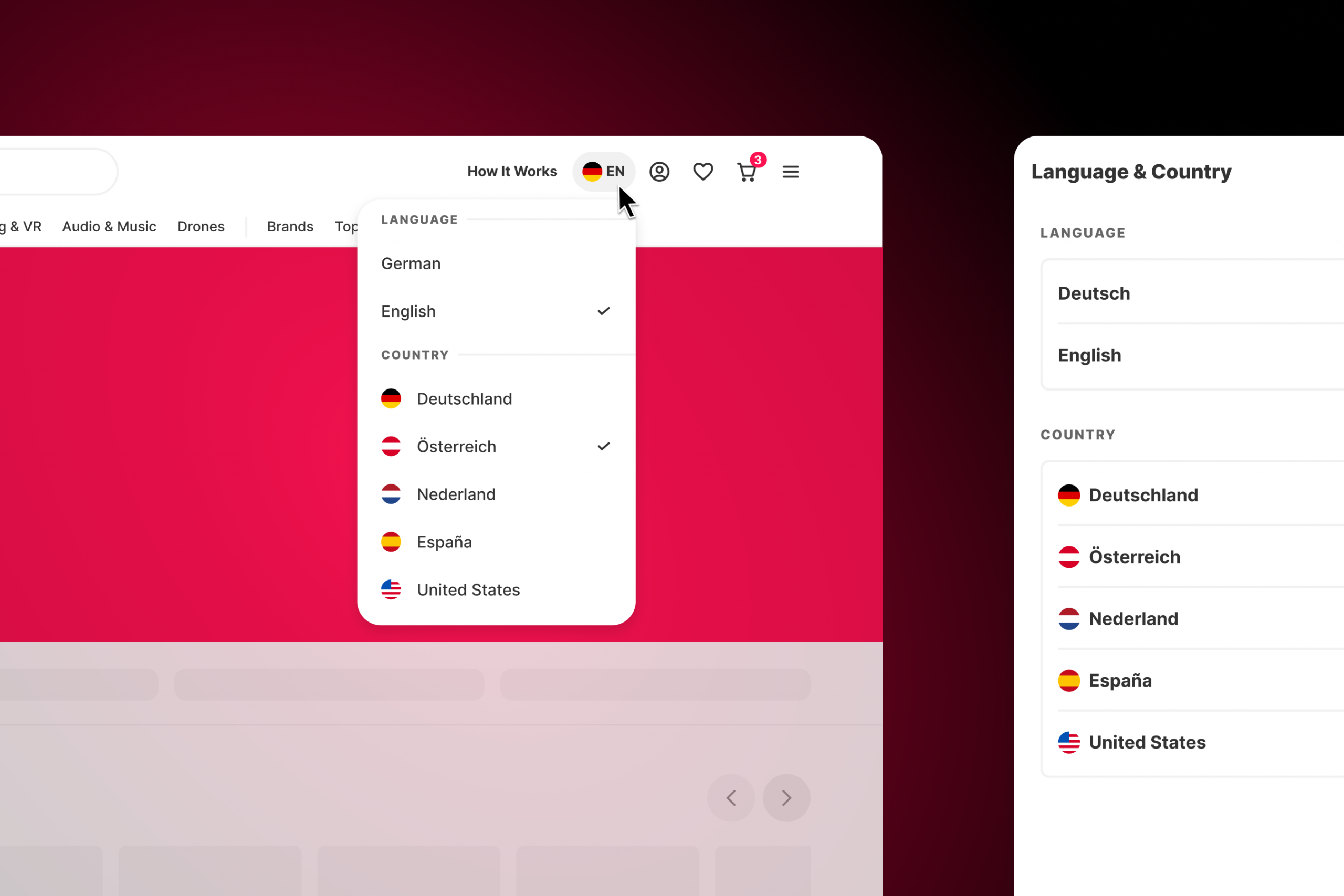
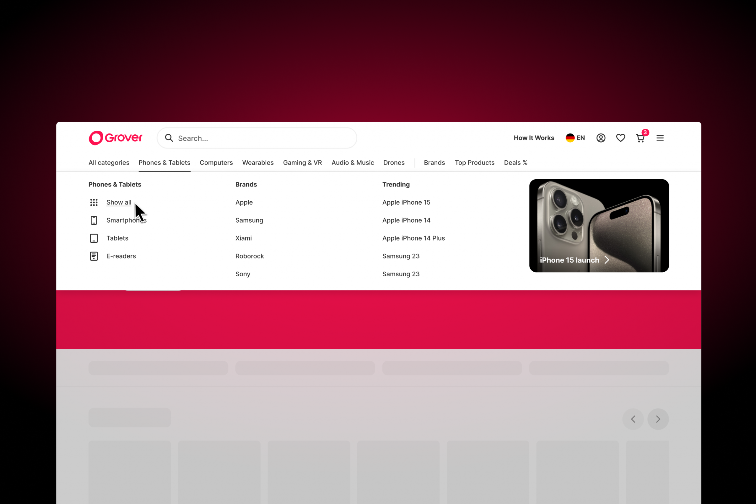
What users saw was a basic structure: a hamburger menu (even on desktop!), a few text links, a search bar, and a cart icon. What they didn’t see was the chaos behind the curtain: a fragmented tech stack spread across multiple teams, which made even the smallest UI tweaks incredibly hard. There was only limited tracking. We couldn’t tell how people navigated, what worked, or where they dropped off. Changing anything required coordination between silos, and the lack of visibility made it impossible to prioritize improvements.
Users were lost. We were blind. The interface didn’t evolve—and couldn’t.
"Menus are how a user becomes aware of a site’s hierarchy. Menus can also provide shortcuts to frequently-accessed pages that are otherwise buried deep within a sitemap. Getting menus correct so that a site can be navigated is one of the most important aspects of usability."
Yale University - Usability & Web Accessibility
Task
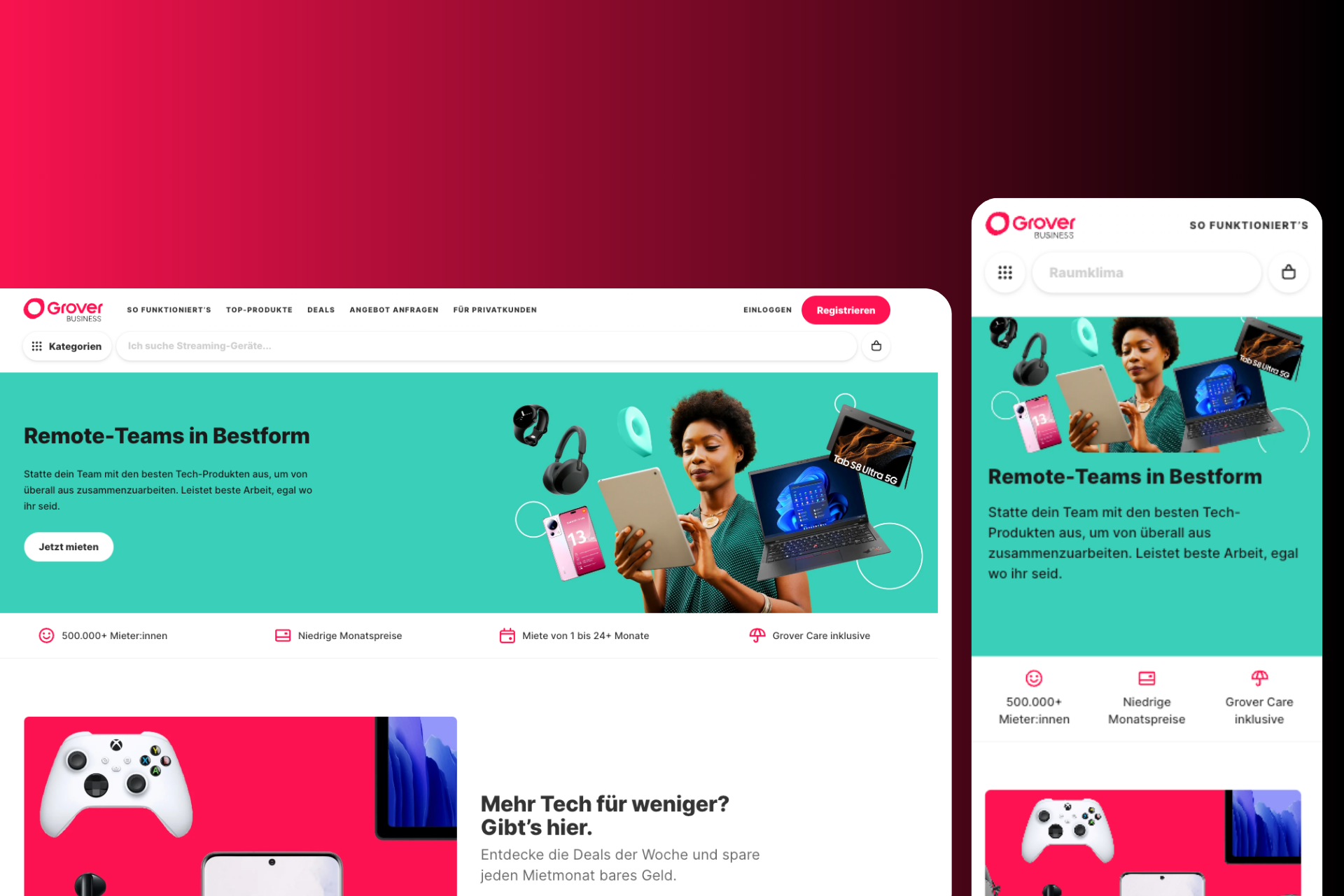
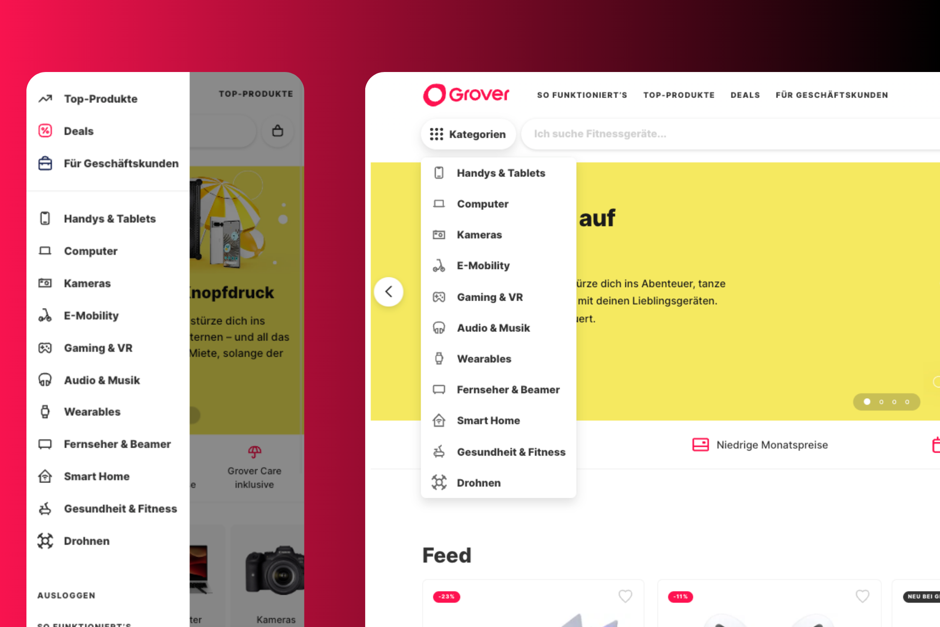
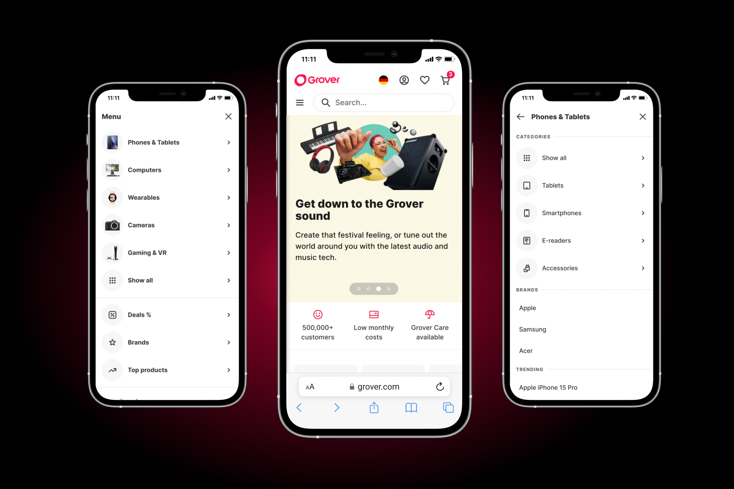
Building the backbone of better browsing
That’s when we decided to redesign not just the header, but the foundation beneath it. Our goal: create a modern, unified navigation system to better support discovery, highlight strategic sections (like brand pages and wish lists), and unlock a new monetization stream via header advertising.
Primary Success
CR Header to Order
PI Category Listings
Secondary Success
CR Wish List to Order
# Orders incl. Wish List prod.
Guardrail Metrics
Header Load Time
Page Load Time
Exit Rate
Tradeoff Metrics
Session Duration
Search Usage Rate
Actions
From insight to implementation
To build something as critical as a new navigation system, we followed a structured yet iterative approach. Each step—from research to rollout—was guided by real user needs, data, and tight cross-functional collaboration.
We analysed best practices as well as industry leaders and mapped out common navigation patterns. This helped us understand what users expect and where we could stand out.
Through card sorting, usability testing, and surveys, we uncovered how users navigate our platform. These insights shaped and refined our concept iteratively.
We launched in phases to monitor performance and mitigate risk. This allowed us to iterate quickly and scale confidently across all B2C markets.
Frameworks/Methods
We used a mix of qualitative and quantitative methods, from Card Sorting, Tree Testing to A/B experiments, to ensure every decision was rooted in real user behaviour and business outcomes.
Deliverables
Our output included mobile and desktop prototypes, a redesigned navigation system for guests and logged-in users, and a live MVP rolled out across all B2C web platforms.
Tools used
We worked in Figma for design, Miro for ideation, Jira for implementation, Google Forms for surveys, and Amplitude for behavioural analytics
Results
Measurable change, meaningful impact
The redesigned header didn’t just look better—it worked better. We turned a bottleneck into a conversion engine. The data spoke volumes: a +32% increase in category-to-order conversions, reduced friction in search, and new advertising brand revenue even before launch. Faster load times and a modern, trackable system made both users and stakeholders happy.
Strategic Impact
The new header became more than just a UI upgrade—it laid the foundation for personalization, smarter content placement, and new monetization.
Next steps
We plan to personalize the header by customer segments, integrate brand placements into our CMS, and apply this proven approach to our B2B offering.
Learnings
Redesigns aren’t just about pixels—they’re about systems. Cross-team alignment, real user insight, and thoughtful iteration turned a tech debt relic into a product growth lever.
Great products are never build in silos, I therefore like to thank an amazing group of people working with me on this project: Ana-Maria Ghinita, Inna Nichiporenko (both Design), Gabe Silva, Sergio Behrends, Ema, Karan, Gedewon, Leda (all Engineering), Olawale Jenyo, Patrick Geaney and everybody else I might be missing.